Creating a striking photomontage that commands attention and conveys a clear narrative demands more than simply arranging a few snapshots side by side. The secret to elevating your collage work from amateur to professional lies in mastering fundamental compositional principles, particularly the venerable rule of thirds. This technique, widely revered across photography and graphic design, serves as the backbone of visually compelling layouts, guiding the eye naturally through your assembled images and ensuring each element contributes to a harmonious whole. Whether you're preparing a montage for sharing on social networks, crafting a feature for your blog, or experimenting with creative expression, understanding this rule will transform your approach to design and deliver results that truly resonate.
Understanding the rule of thirds for visually compelling photomontages
What the rule of thirds means for digital composition and graphic design
At its core, the rule of thirds is a compositional guideline that involves dividing your canvas or frame into nine equal parts by overlaying two evenly spaced horizontal lines and two evenly spaced vertical lines. This creates a grid that highlights four key intersection points, often referred to as power points. The principle suggests that placing the most important elements of your image along these lines or at their intersections generates a more balanced, dynamic, and visually engaging composition compared to centring everything in the middle. For those working with photomontages, this approach is invaluable. When assembling multiple images into a single cohesive design, each photograph or graphic element should be positioned thoughtfully to draw the viewer's gaze across the entire montage rather than leaving them staring at a static, central focal point. The rule helps prevent your collage from appearing flat or lifeless, instead encouraging movement and interest as the eye travels from one power point to another. This technique is not confined to traditional photography; it applies equally to digital graphic design, where the arrangement of text, icons, and images benefits from the same sense of proportion and balance. By aligning key features such as a subject's eyes, a horizon line, or a dominant colour block with the gridlines or their intersections, you create an off-centre composition that feels both natural and professionally polished. The beauty of the rule of thirds is its simplicity combined with its effectiveness, making it accessible even to those new to photomontage while still offering depth for experienced designers seeking to refine their work.
Applying grid overlays and focal points to enhance your photo collage layouts
Implementing the rule of thirds in your photomontage begins with activating grid overlays in your chosen editing software or application. Most modern photo editing platforms, from industry-standard tools in the Adobe Creative Suite to free alternatives and mobile apps for Android and iOS, include a gridline feature that superimposes the rule of thirds grid directly onto your workspace. This visual aid allows you to position each image or layer with precision, ensuring that critical elements align with the grid's guidelines. When arranging a landscape photograph within your montage, for instance, consider placing the horizon line along the upper or lower horizontal gridline to either emphasise the sky or highlight the foreground. In portrait compositions, positioning a subject's eyes along the upper horizontal line or at an upper power point naturally draws the viewer's attention and creates a more engaging focal point. Wildlife and street photography benefit similarly, with subjects aligned along vertical gridlines to introduce balance and visual interest. Beyond individual photographs, the rule of thirds can guide the placement of multiple images within a single montage. If you are creating a collage that combines several photos, use the grid to distribute them evenly across the canvas, placing key elements at the intersections to maintain rhythm and coherence. Incorporating leading lines, such as roads, fences, or architectural features, along the gridlines further enhances the sense of depth and movement. Negative space, the empty areas surrounding your focal points, also plays a crucial role in this process. By deliberately leaving certain sections of the grid open, you allow the viewer's eye to rest and prevent the montage from feeling overcrowded. Post-processing offers an additional opportunity to refine your composition. Cropping tools in software like Lightroom or Photoshop enable you to adjust the framing of individual images to better align with the rule of thirds, even if the original photograph was not composed with the grid in mind. This flexibility is particularly useful when working with a diverse collection of images, as it allows you to harmonise disparate elements into a unified design. Remember, whilst the rule of thirds is a powerful guideline, it is not an inflexible law. Experienced designers often break the rule intentionally to achieve symmetrical compositions, fill the frame for dramatic impact, or create unique effects that challenge conventional expectations. The key is to understand the rule thoroughly so that when you choose to deviate, it is a deliberate creative decision rather than an oversight.
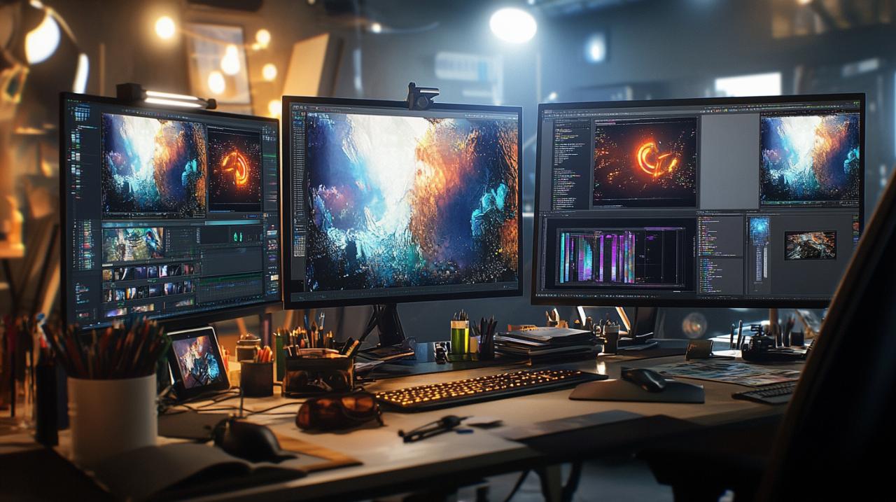
Essential tools and applications for crafting professional photomontages
Choosing between Adobe Creative Suite and free editing software for your montage projects
Selecting the right software is a pivotal step in your journey towards creating professional-grade photomontages. Adobe Creative Suite, particularly Photoshop and Lightroom, remains the gold standard for photographers and graphic designers worldwide. Photoshop offers unparalleled control over layers, masks, and blending modes, allowing you to assemble, retouch, and perfect even the most complex collages. Its extensive library of filters, adjustment tools, and retouching brushes enables precise colour grading, seamless merging of images, and the addition of sophisticated effects that elevate your montage beyond simple assemblage. Lightroom complements this with powerful cataloguing and batch editing capabilities, making it ideal for managing large collections of photos and applying consistent adjustments across multiple images before bringing them into Photoshop for final assembly. The suite's integration with 3D LUTs, colour grading actions, and cinematic effects further expands your creative toolkit, providing professional-level enhancements that can transform the mood and tone of your montage. However, the Adobe ecosystem comes at a cost, typically requiring a subscription that may not suit everyone's budget. For those seeking equally capable yet free alternatives, several options stand out. GIMP, an open-source image editor, provides many of the same layer-based editing features as Photoshop, including support for advanced masking, retouching, and plugin extensions that replicate premium effects. Whilst its interface may require a learning curve for those accustomed to Adobe's layout, GIMP remains a robust choice for creating intricate photomontages without financial investment. Another excellent free tool is Canva, which, although more template-driven and less granular than Photoshop, excels at rapid collage creation with intuitive drag-and-drop functionality, pre-designed grids that naturally align with compositional principles, and a vast library of stock images and graphic elements. For photographers who prefer a streamlined workflow, Darktable and RawTherapee offer powerful raw processing and non-destructive editing, ideal for preparing individual images before importing them into a collage-focused application. The choice between paid and free software ultimately depends on the complexity of your projects, your familiarity with different interfaces, and your budget. Many professionals recommend starting with free tools to build foundational skills before investing in premium software, whilst others find that the time saved and advanced features of Adobe justify the subscription cost from the outset. Regardless of your choice, ensure the software supports gridline overlays to assist with rule of thirds composition, offers layer management for flexible arrangement of images, and includes retouching tools for seamless blending and colour correction.
Top mobile apps for Android and iOS to create stunning collages on the go
In an increasingly mobile world, the ability to craft impressive photomontages directly from your smartphone or tablet offers unmatched convenience and spontaneity. Both Android and iOS platforms host a wealth of applications designed specifically for collage creation, many of which incorporate the rule of thirds and other compositional aids to help you achieve professional results on the go. Adobe Lightroom Mobile and Photoshop Express bring scaled-down versions of their desktop counterparts to your pocket, offering layer-based editing, advanced colour grading, and access to Adobe's extensive preset library, including 3D LUTs and cinematic filters. These apps sync seamlessly with Adobe Creative Cloud, allowing you to start a project on your phone and finish it on your desktop without missing a beat. For those seeking free or low-cost options, Snapseed by Google stands out as a powerful and intuitive editor with a comprehensive suite of tools, including selective adjustments, healing brushes, and perspective correction, all essential for preparing images before assembling them into a montage. Its user-friendly interface and support for non-destructive editing make it a favourite among mobile photographers. Canva's mobile app mirrors the versatility of its web platform, offering hundreds of collage templates, grid layouts that adhere to compositional best practices, and an extensive library of fonts, stickers, and graphic elements to enhance your design. PicsArt is another popular choice, blending photo editing, collage creation, and social networking features in a single app. It includes a wide range of effects, overlays, and drawing tools, enabling you to add artistic touches and personalise your montage with text or hand-drawn elements. For those focused specifically on grid-based collages, apps like Layout from Instagram and Pic Collage provide simple, fast solutions for arranging multiple photos into a single frame, with automatic alignment to ensure balanced compositions. These apps are ideal for quickly creating content for social networks like Instagram, Pinterest, and Facebook, where visual impact and rapid turnaround are paramount. Many of these mobile applications also include built-in sharing features, allowing you to export your finished photomontage directly to your preferred social platform with optimised dimensions and resolution. When selecting a mobile app, consider factors such as ease of use, availability of compositional grids, support for high-resolution exports, and compatibility with your device's operating system. The best apps will offer a balance of creative freedom and guided assistance, helping you apply the rule of thirds naturally whilst still allowing room for experimentation and breaking the rules when the design calls for it. With the right mobile tools at your fingertips, you can capture, edit, and share stunning photomontages anytime inspiration strikes, all whilst maintaining the professional balance and impact that distinguish exceptional work from the ordinary.
Step-by-step techniques to assemble, retouch, and perfect your photomontage
Selecting and arranging images for maximum visual impact and balanced composition
The foundation of any compelling photomontage lies in the careful selection and arrangement of your source images. Begin by curating a collection of photographs that share a common theme, colour palette, or narrative thread. This cohesion is essential for ensuring that the final montage feels intentional rather than haphazard. As you review your images, look for strong focal points such as a subject's eyes, a prominent architectural feature, or a striking natural element. These will serve as your anchor points when applying the rule of thirds. Before importing your images into your chosen editing software, assess each photograph individually, considering how its composition might align with the grid overlays. If you have a portrait with the subject's gaze directed to the left, plan to position it on the right side of your montage to allow the viewer's eye to follow the implied direction across the canvas. Similarly, landscape images with horizons can be placed along horizontal gridlines, either at the top or bottom third, depending on whether you wish to emphasise the sky or the foreground. Once you have selected your images, open your editing application and activate the rule of thirds grid overlay. Create a new canvas or workspace at your desired dimensions, ensuring it matches the aspect ratio suitable for your intended platform, whether that be a square format for Instagram, a widescreen layout for Pinterest, or a custom size for print. Begin importing your images as separate layers, allowing you to move, scale, and rotate each one independently. Position your first image so that its primary focal point aligns with one of the four power points on the grid. This initial placement sets the tone for the rest of the montage and establishes a visual hierarchy. Add subsequent images, staggering their focal points across the remaining power points to create a sense of rhythm and movement. Avoid clustering all points of interest in one area, as this can lead to visual imbalance and leave other sections of the montage feeling empty or neglected. Incorporate leading lines where possible, using elements such as roads, rivers, or architectural features to guide the viewer's eye from one image to the next. Negative space is equally important; allow some areas of the canvas to remain open or filled with a subtle background colour to give the composition room to breathe. This technique prevents the montage from appearing cluttered and helps maintain focus on your key images. As you arrange your layers, experiment with different scales and overlaps. Enlarging a particularly striking image can establish it as the dominant element, whilst smaller, supporting images add context and depth. Overlapping images slightly can create a sense of continuity and connection, but be mindful of maintaining clarity and ensuring that each photograph remains recognisable and contributes to the overall narrative. Throughout this process, step back regularly to view the montage as a whole, checking that the composition remains balanced and that the rule of thirds is guiding the viewer's eye naturally across the design. If an element feels out of place, adjust its position or size until the entire montage achieves the harmonious balance and dynamic impact you seek. This iterative approach, combining careful planning with ongoing refinement, is the hallmark of professional photomontage work and ensures that your final product is both visually compelling and compositionally sound.
Adding effects, adjusting layers, and finalising your design for Instagram, Pinterest, and social networks
With your images arranged and the composition balanced according to the rule of thirds, the next stage involves adding effects, adjusting layers, and refining the overall aesthetic to ensure your photomontage stands out on social networks. Begin by reviewing the colour grading across all your images. Consistency in tone and colour temperature is crucial for a cohesive montage, so use adjustment layers to harmonise the hues, saturation, and brightness levels. Many professionals rely on 3D LUTs and Lightroom presets to achieve a unified look quickly. For instance, applying a natural light LUT inspired by the ambient warmth of New Orleans can infuse your montage with a soft, inviting glow that enhances portraits and landscapes alike. Experiment with colour grading actions and cinematic effects to establish a mood, whether that be vibrant and energetic for travel montages or muted and contemplative for fine art compositions. Once the colours are balanced, turn your attention to retouching individual images. Use healing brushes and clone stamps to remove distracting elements, smooth skin tones in portraits, or correct imperfections that detract from the overall impact. Subtle vignetting can draw the eye towards the centre of the montage, whilst slight sharpening enhances detail and clarity, particularly important for images destined for high-resolution displays. As you refine each layer, consider adding subtle overlays or textures to introduce depth and visual interest. Overlay effects such as light leaks, film grain, or bokeh can add a professional polish and evoke a particular aesthetic, but use these sparingly to avoid overwhelming the composition. Adjustment of layer opacity and blending modes allows you to merge images seamlessly, creating smooth transitions between overlapping elements and ensuring that no single photograph feels disjointed from the rest. If your montage includes text or graphic elements, position these according to the rule of thirds as well, aligning headings or captions with the gridlines to maintain compositional consistency. Typography should complement rather than compete with the imagery, so choose fonts and sizes that enhance readability without obscuring your carefully arranged photos. Before finalising, zoom out and review the entire montage on different devices and screen sizes. What looks balanced on a desktop monitor may appear cramped or misaligned on a mobile screen, so make necessary adjustments to ensure your design translates well across platforms. Pay particular attention to the dimensions and aspect ratios favoured by Instagram, Pinterest, and other social networks. Instagram, for example, supports square, portrait, and landscape formats, whilst Pinterest tends to favour vertical layouts that maximise visibility in feeds. Export your montage at the highest resolution supported by your target platform, typically at least 1080 pixels on the shortest side for Instagram, to preserve detail and sharpness. If you plan to share across multiple channels, create platform-specific versions optimised for each format, adjusting crops and compositions as needed to maintain the rule of thirds in every iteration. Finally, consider adding a watermark or signature to protect your work whilst subtly branding your photomontages. Position this element discreetly, ideally at one of the lower power points, so it does not distract from the main composition but remains visible enough to credit your authorship. Once you are satisfied with the final design, save your project file to preserve all layers and adjustments for future edits, and export a flattened version ready for uploading. By meticulously adding effects, adjusting layers, and tailoring your montage for specific social networks, you ensure that your creation not only adheres to professional compositional standards but also captures attention and engages viewers wherever it is shared. This comprehensive approach, grounded in the rule of thirds and enhanced by thoughtful retouching and colour grading, is what distinguishes a truly exceptional photomontage from a simple collection of images, delivering the balance and impact that define professional-grade work.

Master the rule of thirds: How to create a photomontage like a pro with professional-grade balance and impact
25 April 2026
canariasfoto
Creating a striking photomontage that commands attention and conveys a clear narrative demands more than simply arranging a few snapshots side by side. The secret to elevating your collage work from amateur to professional lies in mastering fundamental compositional principles, particularly the venerable rule of thirds. This technique, widely revered across photography and graphic design, serves as the backbone of visually compelling layouts, guiding the eye naturally through your assembled images and ensuring each element contributes to a harmonious whole. Whether you're preparing a montage for sharing on social networks, crafting a feature for your blog, or experimenting with creative expression, understanding this rule will transform your approach to design and deliver results that truly resonate.
Understanding the rule of thirds for visually compelling photomontages
What the rule of thirds means for digital composition and graphic design
At its core, the rule of thirds is a compositional guideline that involves dividing your canvas or frame into nine equal parts by overlaying two evenly spaced horizontal lines and two evenly spaced vertical lines. This creates a grid that highlights four key intersection points, often referred to as power points. The principle suggests that placing the most important elements of your image along these lines or at their intersections generates a more balanced, dynamic, and visually engaging composition compared to centring everything in the middle. For those working with photomontages, this approach is invaluable. When assembling multiple images into a single cohesive design, each photograph or graphic element should be positioned thoughtfully to draw the viewer's gaze across the entire montage rather than leaving them staring at a static, central focal point. The rule helps prevent your collage from appearing flat or lifeless, instead encouraging movement and interest as the eye travels from one power point to another. This technique is not confined to traditional photography; it applies equally to digital graphic design, where the arrangement of text, icons, and images benefits from the same sense of proportion and balance. By aligning key features such as a subject's eyes, a horizon line, or a dominant colour block with the gridlines or their intersections, you create an off-centre composition that feels both natural and professionally polished. The beauty of the rule of thirds is its simplicity combined with its effectiveness, making it accessible even to those new to photomontage while still offering depth for experienced designers seeking to refine their work.
Applying grid overlays and focal points to enhance your photo collage layouts
Implementing the rule of thirds in your photomontage begins with activating grid overlays in your chosen editing software or application. Most modern photo editing platforms, from industry-standard tools in the Adobe Creative Suite to free alternatives and mobile apps for Android and iOS, include a gridline feature that superimposes the rule of thirds grid directly onto your workspace. This visual aid allows you to position each image or layer with precision, ensuring that critical elements align with the grid's guidelines. When arranging a landscape photograph within your montage, for instance, consider placing the horizon line along the upper or lower horizontal gridline to either emphasise the sky or highlight the foreground. In portrait compositions, positioning a subject's eyes along the upper horizontal line or at an upper power point naturally draws the viewer's attention and creates a more engaging focal point. Wildlife and street photography benefit similarly, with subjects aligned along vertical gridlines to introduce balance and visual interest. Beyond individual photographs, the rule of thirds can guide the placement of multiple images within a single montage. If you are creating a collage that combines several photos, use the grid to distribute them evenly across the canvas, placing key elements at the intersections to maintain rhythm and coherence. Incorporating leading lines, such as roads, fences, or architectural features, along the gridlines further enhances the sense of depth and movement. Negative space, the empty areas surrounding your focal points, also plays a crucial role in this process. By deliberately leaving certain sections of the grid open, you allow the viewer's eye to rest and prevent the montage from feeling overcrowded. Post-processing offers an additional opportunity to refine your composition. Cropping tools in software like Lightroom or Photoshop enable you to adjust the framing of individual images to better align with the rule of thirds, even if the original photograph was not composed with the grid in mind. This flexibility is particularly useful when working with a diverse collection of images, as it allows you to harmonise disparate elements into a unified design. Remember, whilst the rule of thirds is a powerful guideline, it is not an inflexible law. Experienced designers often break the rule intentionally to achieve symmetrical compositions, fill the frame for dramatic impact, or create unique effects that challenge conventional expectations. The key is to understand the rule thoroughly so that when you choose to deviate, it is a deliberate creative decision rather than an oversight.
Essential tools and applications for crafting professional photomontages
Choosing between Adobe Creative Suite and free editing software for your montage projects
Selecting the right software is a pivotal step in your journey towards creating professional-grade photomontages. Adobe Creative Suite, particularly Photoshop and Lightroom, remains the gold standard for photographers and graphic designers worldwide. Photoshop offers unparalleled control over layers, masks, and blending modes, allowing you to assemble, retouch, and perfect even the most complex collages. Its extensive library of filters, adjustment tools, and retouching brushes enables precise colour grading, seamless merging of images, and the addition of sophisticated effects that elevate your montage beyond simple assemblage. Lightroom complements this with powerful cataloguing and batch editing capabilities, making it ideal for managing large collections of photos and applying consistent adjustments across multiple images before bringing them into Photoshop for final assembly. The suite's integration with 3D LUTs, colour grading actions, and cinematic effects further expands your creative toolkit, providing professional-level enhancements that can transform the mood and tone of your montage. However, the Adobe ecosystem comes at a cost, typically requiring a subscription that may not suit everyone's budget. For those seeking equally capable yet free alternatives, several options stand out. GIMP, an open-source image editor, provides many of the same layer-based editing features as Photoshop, including support for advanced masking, retouching, and plugin extensions that replicate premium effects. Whilst its interface may require a learning curve for those accustomed to Adobe's layout, GIMP remains a robust choice for creating intricate photomontages without financial investment. Another excellent free tool is Canva, which, although more template-driven and less granular than Photoshop, excels at rapid collage creation with intuitive drag-and-drop functionality, pre-designed grids that naturally align with compositional principles, and a vast library of stock images and graphic elements. For photographers who prefer a streamlined workflow, Darktable and RawTherapee offer powerful raw processing and non-destructive editing, ideal for preparing individual images before importing them into a collage-focused application. The choice between paid and free software ultimately depends on the complexity of your projects, your familiarity with different interfaces, and your budget. Many professionals recommend starting with free tools to build foundational skills before investing in premium software, whilst others find that the time saved and advanced features of Adobe justify the subscription cost from the outset. Regardless of your choice, ensure the software supports gridline overlays to assist with rule of thirds composition, offers layer management for flexible arrangement of images, and includes retouching tools for seamless blending and colour correction.
Top mobile apps for Android and iOS to create stunning collages on the go
In an increasingly mobile world, the ability to craft impressive photomontages directly from your smartphone or tablet offers unmatched convenience and spontaneity. Both Android and iOS platforms host a wealth of applications designed specifically for collage creation, many of which incorporate the rule of thirds and other compositional aids to help you achieve professional results on the go. Adobe Lightroom Mobile and Photoshop Express bring scaled-down versions of their desktop counterparts to your pocket, offering layer-based editing, advanced colour grading, and access to Adobe's extensive preset library, including 3D LUTs and cinematic filters. These apps sync seamlessly with Adobe Creative Cloud, allowing you to start a project on your phone and finish it on your desktop without missing a beat. For those seeking free or low-cost options, Snapseed by Google stands out as a powerful and intuitive editor with a comprehensive suite of tools, including selective adjustments, healing brushes, and perspective correction, all essential for preparing images before assembling them into a montage. Its user-friendly interface and support for non-destructive editing make it a favourite among mobile photographers. Canva's mobile app mirrors the versatility of its web platform, offering hundreds of collage templates, grid layouts that adhere to compositional best practices, and an extensive library of fonts, stickers, and graphic elements to enhance your design. PicsArt is another popular choice, blending photo editing, collage creation, and social networking features in a single app. It includes a wide range of effects, overlays, and drawing tools, enabling you to add artistic touches and personalise your montage with text or hand-drawn elements. For those focused specifically on grid-based collages, apps like Layout from Instagram and Pic Collage provide simple, fast solutions for arranging multiple photos into a single frame, with automatic alignment to ensure balanced compositions. These apps are ideal for quickly creating content for social networks like Instagram, Pinterest, and Facebook, where visual impact and rapid turnaround are paramount. Many of these mobile applications also include built-in sharing features, allowing you to export your finished photomontage directly to your preferred social platform with optimised dimensions and resolution. When selecting a mobile app, consider factors such as ease of use, availability of compositional grids, support for high-resolution exports, and compatibility with your device's operating system. The best apps will offer a balance of creative freedom and guided assistance, helping you apply the rule of thirds naturally whilst still allowing room for experimentation and breaking the rules when the design calls for it. With the right mobile tools at your fingertips, you can capture, edit, and share stunning photomontages anytime inspiration strikes, all whilst maintaining the professional balance and impact that distinguish exceptional work from the ordinary.
Step-by-step techniques to assemble, retouch, and perfect your photomontage
Selecting and arranging images for maximum visual impact and balanced composition
The foundation of any compelling photomontage lies in the careful selection and arrangement of your source images. Begin by curating a collection of photographs that share a common theme, colour palette, or narrative thread. This cohesion is essential for ensuring that the final montage feels intentional rather than haphazard. As you review your images, look for strong focal points such as a subject's eyes, a prominent architectural feature, or a striking natural element. These will serve as your anchor points when applying the rule of thirds. Before importing your images into your chosen editing software, assess each photograph individually, considering how its composition might align with the grid overlays. If you have a portrait with the subject's gaze directed to the left, plan to position it on the right side of your montage to allow the viewer's eye to follow the implied direction across the canvas. Similarly, landscape images with horizons can be placed along horizontal gridlines, either at the top or bottom third, depending on whether you wish to emphasise the sky or the foreground. Once you have selected your images, open your editing application and activate the rule of thirds grid overlay. Create a new canvas or workspace at your desired dimensions, ensuring it matches the aspect ratio suitable for your intended platform, whether that be a square format for Instagram, a widescreen layout for Pinterest, or a custom size for print. Begin importing your images as separate layers, allowing you to move, scale, and rotate each one independently. Position your first image so that its primary focal point aligns with one of the four power points on the grid. This initial placement sets the tone for the rest of the montage and establishes a visual hierarchy. Add subsequent images, staggering their focal points across the remaining power points to create a sense of rhythm and movement. Avoid clustering all points of interest in one area, as this can lead to visual imbalance and leave other sections of the montage feeling empty or neglected. Incorporate leading lines where possible, using elements such as roads, rivers, or architectural features to guide the viewer's eye from one image to the next. Negative space is equally important; allow some areas of the canvas to remain open or filled with a subtle background colour to give the composition room to breathe. This technique prevents the montage from appearing cluttered and helps maintain focus on your key images. As you arrange your layers, experiment with different scales and overlaps. Enlarging a particularly striking image can establish it as the dominant element, whilst smaller, supporting images add context and depth. Overlapping images slightly can create a sense of continuity and connection, but be mindful of maintaining clarity and ensuring that each photograph remains recognisable and contributes to the overall narrative. Throughout this process, step back regularly to view the montage as a whole, checking that the composition remains balanced and that the rule of thirds is guiding the viewer's eye naturally across the design. If an element feels out of place, adjust its position or size until the entire montage achieves the harmonious balance and dynamic impact you seek. This iterative approach, combining careful planning with ongoing refinement, is the hallmark of professional photomontage work and ensures that your final product is both visually compelling and compositionally sound.
Adding effects, adjusting layers, and finalising your design for Instagram, Pinterest, and social networks
With your images arranged and the composition balanced according to the rule of thirds, the next stage involves adding effects, adjusting layers, and refining the overall aesthetic to ensure your photomontage stands out on social networks. Begin by reviewing the colour grading across all your images. Consistency in tone and colour temperature is crucial for a cohesive montage, so use adjustment layers to harmonise the hues, saturation, and brightness levels. Many professionals rely on 3D LUTs and Lightroom presets to achieve a unified look quickly. For instance, applying a natural light LUT inspired by the ambient warmth of New Orleans can infuse your montage with a soft, inviting glow that enhances portraits and landscapes alike. Experiment with colour grading actions and cinematic effects to establish a mood, whether that be vibrant and energetic for travel montages or muted and contemplative for fine art compositions. Once the colours are balanced, turn your attention to retouching individual images. Use healing brushes and clone stamps to remove distracting elements, smooth skin tones in portraits, or correct imperfections that detract from the overall impact. Subtle vignetting can draw the eye towards the centre of the montage, whilst slight sharpening enhances detail and clarity, particularly important for images destined for high-resolution displays. As you refine each layer, consider adding subtle overlays or textures to introduce depth and visual interest. Overlay effects such as light leaks, film grain, or bokeh can add a professional polish and evoke a particular aesthetic, but use these sparingly to avoid overwhelming the composition. Adjustment of layer opacity and blending modes allows you to merge images seamlessly, creating smooth transitions between overlapping elements and ensuring that no single photograph feels disjointed from the rest. If your montage includes text or graphic elements, position these according to the rule of thirds as well, aligning headings or captions with the gridlines to maintain compositional consistency. Typography should complement rather than compete with the imagery, so choose fonts and sizes that enhance readability without obscuring your carefully arranged photos. Before finalising, zoom out and review the entire montage on different devices and screen sizes. What looks balanced on a desktop monitor may appear cramped or misaligned on a mobile screen, so make necessary adjustments to ensure your design translates well across platforms. Pay particular attention to the dimensions and aspect ratios favoured by Instagram, Pinterest, and other social networks. Instagram, for example, supports square, portrait, and landscape formats, whilst Pinterest tends to favour vertical layouts that maximise visibility in feeds. Export your montage at the highest resolution supported by your target platform, typically at least 1080 pixels on the shortest side for Instagram, to preserve detail and sharpness. If you plan to share across multiple channels, create platform-specific versions optimised for each format, adjusting crops and compositions as needed to maintain the rule of thirds in every iteration. Finally, consider adding a watermark or signature to protect your work whilst subtly branding your photomontages. Position this element discreetly, ideally at one of the lower power points, so it does not distract from the main composition but remains visible enough to credit your authorship. Once you are satisfied with the final design, save your project file to preserve all layers and adjustments for future edits, and export a flattened version ready for uploading. By meticulously adding effects, adjusting layers, and tailoring your montage for specific social networks, you ensure that your creation not only adheres to professional compositional standards but also captures attention and engages viewers wherever it is shared. This comprehensive approach, grounded in the rule of thirds and enhanced by thoughtful retouching and colour grading, is what distinguishes a truly exceptional photomontage from a simple collection of images, delivering the balance and impact that define professional-grade work.
Fujifilm Instax Mini 9 Review: Ideal for Beginners Who Love Sharing Physical Memories with Mates
Instant photography has made a remarkable comeback, and few cameras embody this revival quite like the Fujifilm Instax Mini 9.
Master the rule of thirds: How to create a photomontage like a pro with professional-grade balance and impact
Creating a striking photomontage that commands attention and conveys a clear narrative demands more than simply arranging a few snapshots